An artist’s collaboration is not the easiest exhibition to stage. Seeing as most artists are solitary creatures who prefer to work on their own, teaming up with another artist (or a group of artists) can pose challenges. This is the case when there are different approaches, mediums, values and philosophies. And that’s not even including curatorial methodology, but I won’t delve into that this time.
The exhibition Artful Alliance is very much an example that gets art collaboration right. The exhibition is located on the second floor of the Burrinja Cultural Centre, a location that has a number of artist studios of varying mediums and styles. Even before seeing the exhibition, a sense of an artists’ community is instilled in the viewer, especially when walking past these studios in order to go up the stairs to the exhibition. Two artists make up Artful Alliance: Alison Fabiny, a digital photographer and Vicki Singleton, a mixed media painter. Unlike the contained gallery space downstairs, this upstairs space is transitional, a corridor in which audiences walk through in order to view the works. Vicki’s work is on the left, while Alison’s is on the right. When I first saw this, I assumed this was more to separate the artists due to a difference in medium and style, but after returning to the starting point to view the works a second time, it seems there might have been another purpose for this. In facing each other, the artists are in conversation, each complementing the other on their respective styles. What do I mean by this? I’ll go more into depth.
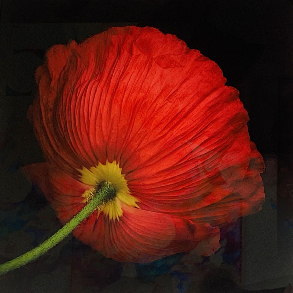
Alison’s work is exclusively focussed on flowers, though there is a variety of subjects that she uses. Flowers are either photographed outdoors (often with a blurred background, so the flower itself, rather than the context becomes the focal point), or in a studio with a white or black background. While the works of white backgrounds give the subjects more of an illustrative quality, it is the solid black backgrounds that cause the colours to stand out and command the viewer’s attention. Although Alison captures flowers close up, they are not to the same level of macrophotography, because the subjects are still at a distance that makes them recognisable and less abstract. Most of these flowers are taken front-on, though some have been taken from very interesting angles. Paper Daisy Plumage, for instance, captures a daisy on a slight tilt, the bottom left petals cropped out, giving a view of a fairly commonplace subject that we would not normally see. Instead of seeing the yellow centre of the daisy first, and then the surrounding petals, we get a view of the layers of petals beneath. A similar technique has been applied to Red Poppy Silk, which cleverly turns away from orthodoxy by photographing behind the flower, rather than in front. The stem hangs hangs from the top left corner, the petals of the poppy turned downwards and away from the viewer’s gaze. In capturing this viewpoint, audiences become more aware of the different elements that make up a flower and how these grow together, rather than the ornamental front view of the flower that is regularly depicted in still life works. In seeing the flower in this way, it almost serves a reminder of how fragile nature really is. We often take nature for granted by only seeing the front view of flowers, rather than the disparate parts that hold them together. While I never had the chance to visit the Melbourne International Flower & Garden Show, these works would have been ideal for such an exhibition, and probably would stand out in the best way possible. They are professionally taken, with an eye for detail that even someone without an interest in botany (such as myself) would find intriguing.
In contrast to Alison, Vicki’s paintings tend to cover various elements of nature, rather than on a specific subject. However, it should be noted that like Alison, Vicki’s works do contain a formulaic element to them: Larger works tend to be more figurative and painterly, whereas smaller, (and sometimes square canvases) are looser in subject matter and contains more collage. Works have ranged from underwater scenes to forests, often with a similar vibrant colour palette. Vicki layers her paintings with stamps and stencils, sometimes even words. Chinese characters or reversed English words are used, which adds a figurative as well as physical layer to the work. Her work In the Depths is especially strong. At the centre of the composition, a whale swims downwards, facing the viewer’s left, while flanked by two jellyfish, one swimming downwards whilst the other stands upright. There is an effective sense of balance as the whale, despite being in the middle, does not completely dominate the viewer’s attention. This is achieved through Vicki’s use of what appears to be sporadic brushstrokes, particularly on the top left, as well as spotlights of colour throughout the scene. Layers of stencilled seaweed, words and other natural elements are superimposed over the sea creatures and the background, reinvigorating the viewer’s interest and keeping the eye moving around the composition. A similar technique is applied to the work next to it, Deep Dive, which works well as either part of a diptych or as a singular work. A jellyfish is the focal point, while a smaller seahorse and jellyfish to the right look on. Various lines, perhaps outlines of seaweed are etched over the scene, though there is an interesting interplay of yellow and blue splotches of colour that work well together. What seems to be most compelling about Vicki’s work is that she doesn’t use naturalistic colours to depict nature: There is no prominent blue background in any of her underwater works, and the layering of patterns and words create an ethereal essence of a world in the depths: Vicki is not simply depicting what is there verbatim, she is painting beyond that.
While this exhibition was strong, there were a couple of very minor aspects that needed fine-tuning. For instance, the wall labels, as insignificant as they are for most viewers, would have further elevated the quality and professionalism of the exhibition if stuck on foam board. Black frames, (at least for the photography with dark backgrounds) would have brought out the intensity of the colours more so. Yet, these elements did not detract from the quality of the works, as I am viewing and writing this exhibition from a curatorial background, rather than as an art appreciator or artist. Thus, these points would most likely be unnoticed by the main target audience of this exhibition.
With this discussion in mind, we can now turn back to a point I made earlier in this blog: that both Alison and Vicki’s works have a conversation. There is a sense of contrast in both artists’ styles, from methodical to sporadic, varied to focussed. But at the same time, there is also a sense of similarity and continuity which bridges these artists together, rather than setting them at odds with one another. Both Alison and Vicki use nature as inspiration for their works, yet portray it in a way that allows us to view it with a new perspective. While Alison takes photos of flowers from angles that we would not normally see them, Vicki depicts an underwater scene in a way that challenges the conventional blue sea imagery we are familiar with. It would be interesting to see these artists take these ideas further, yet having seen them experiment with different styles and techniques reveals that they are already in the process of doing so. And this is what helps to capture interest in a transitional space: These are not merely works to decorate a corridor, but vital parts of a conversation that cause us to pause, look and reflect about the way we have being viewing and treating nature in this consumerist society. Since these artists work so well in creating a dialogue, Artful Alliance has proven to be a collaboration that is all worthwhile.


Leave a comment