Recently I had the privilege of visiting Heide’s most recent large-scale photography exhibition, Man Ray and Max Dupain. This is located in the Heide Main Galleries, downstairs Heide III, the largest building on the site. Given the success of the Lee Miller photography exhibition earlier this year, it is good to see that Heide’s curatorial team have followed through with another aspect of modernist photography, this time through Miller’s life partner, Man Ray and pairing this with like-minded Sydney-based photographer, Max Dupain. This choice was unexpected, especially given Heide’s focus on mostly Melburnian artists. Photography is a medium that is not taken seriously enough by art institutions compared to visual art, so credit must be given to Heide’s curators for bringing more representation to an underappreciated medium. Both Man Ray and Max Dupain were not conventional photographers, and despite being based on different sides of the world and never having met one another, there is a similar approach in pushing the medium of photography to its limits. Although I was initially quizzical about the pairing of these photographers, it made more sense looking at the curatorial methodology, which I will elaborate on further.
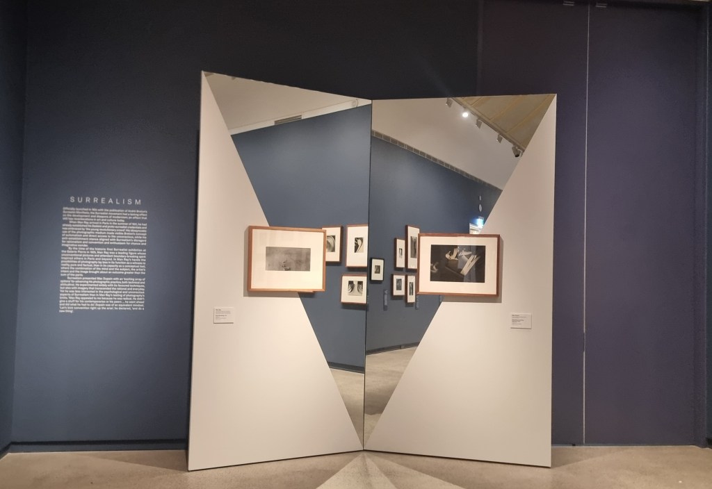
What really struck me when I first visited was the exhibition design, specifically the wall treatment. Each room is of a different colour, which could be symbolic of theme of the works displayed. Upon entering, the dark blue walls of the first gallery space create a striking impression. When reading the contextual text, the room was representative of surrealism, a theme that Ray, and to a lesser extent, Dupain, explored in their respective practices. The dark blue too, seems to evoke a night sky, which makes sense considering surrealism’s roots had stemmed from artists’ dreams. The neutral dark beige tones exemplifies works that explore the body and portraits, while a black backdrop complements works that were specifically created in the dark room (such as photograms). I was not as sure about the green for the room on commercial photography, though at least it did keep interest and prevent museum fatigue, which probably would have been more likely to occur if all the walls of the exhibition were the same colour. I was most impressed with the red room, which is more related to the influences that both Ray and Dupain’s romantic partners had on their creative practices. Not only was this room effective in terms of aesthetics, but it helps to shine a light on the influences that women have had on prominent male artists’ practices that have been largely left out of the western art historical canon. For audiences who had not been able to see the Surrealist Lee Miller exhibition, this room provides some context into the impact Miller had on Ray, while not completely eclipsing his achievements altogether.
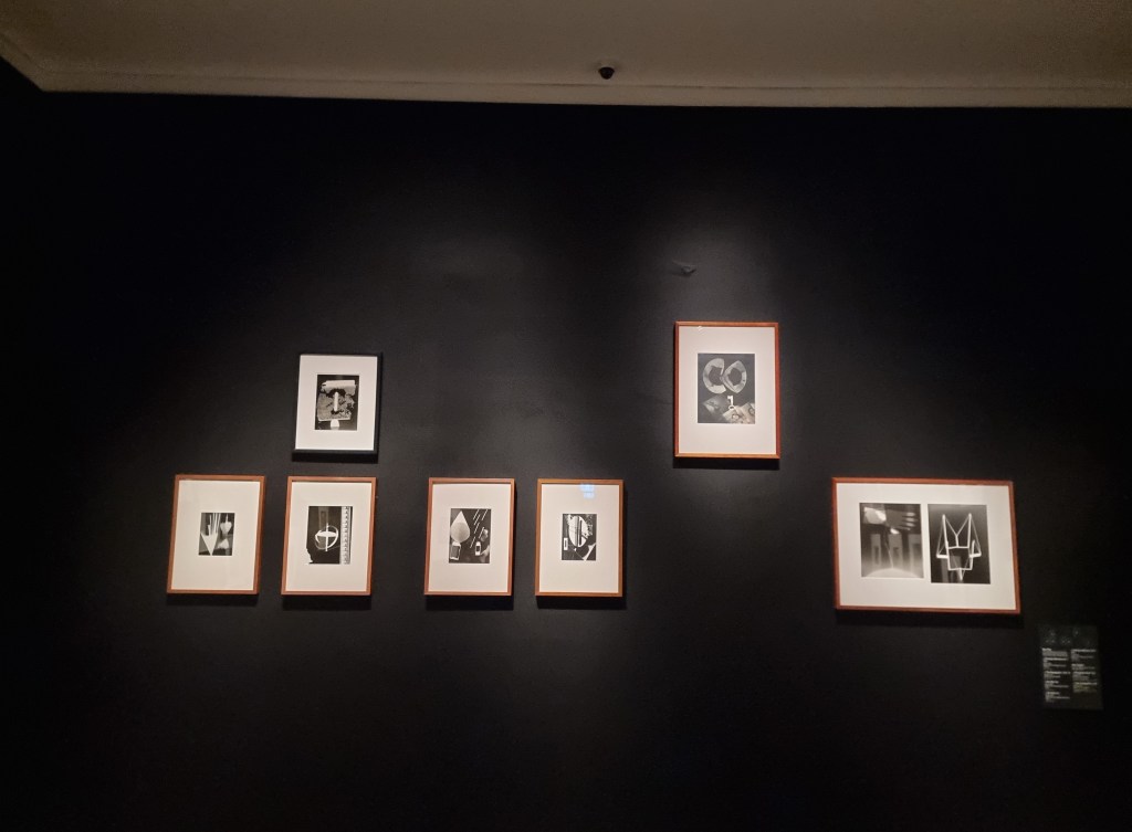
As well as the deviation from the white cube gallery design, the exhibition uses strong geometric shapes and diagonal lines, which seems to point to both artists’ experimentation with abstract forms in their works. The mirrors too, are a strong touch, further reinforcing the illusionism in the camera techniques both Ray and Dupain used. This bold challenge of curatorial norms work well, for the most part. However, when it came to the exhibition hang, this provides more of an inconvenience than an asset. Works were hung at varying heights, not necessarily keeping in line or following any sort of symmetry. Although this could be interpreted as following through with the theme of surrealism, as well as challenging the traditional use of the camera, this haphazard method of hanging not only appeared unbalanced, but also made viewing individual works very difficult. Certain works were hung far above eye level, which to an able-bodied viewer, would be a struggle to see. To a viewer with a mobility device however, these work would be completely inaccessible, causing them to miss out on various parts of the exhibition they paid for. Additionally, placing these works high up had unintentionally brought more focus to some works that were closer to eye level, while others, which seemed to have quality from afar, were put at a disservice, as they could not be viewed more closely. As a result, it felt as if part of the narrative had been missed out, simply because it was out of reach. This could be resolved by using a single-line hang, although this could sacrifice the unconventional hanging aesthetic of the exhibition. If more than one line of works is required due to volume, it might be better to hang works lower, rather than higher. Otherwise, these works could be skied (tilting the edges of the top works downwards so viewers below can see them better).
Thematically, as mentioned previously, the curatorial team have seamlessly combined both artists from different contexts. Both narratives of each artist were written side by side, mostly drawing on very interesting parallels. For instance, although Ray and Dupain had never worked together, both followed a similar career path in starting off in commercial, fashion photography, before progressively becoming more experimental. It was also interesting to see how both artists had photographed everyday objects like bowls and vases and then superimposing other, more organic forms, while also experimenting with lighting. By including such experimental works, it takes away the mundane of commonplace objects and makes us see them in a new light. This too, also shows the breadth and versatility in both artists’ practices. I particularly appreciated how both Ray and Dupain’s partners were not just treated as muses, but rather, as artists in their own right. If the aim of this exhibition was to show similarities of the two artists and their impact on modernist photography, this has been achieved rather successfully. To try and find the differences in each artist, however, required a bit more work on the audience. In many of the works, it almost seemed like the same person had created them. Reliance on wall labels, thus, was necessary.
This brings me to my next point, which also hinges on the earlier critique I had made: Accessibility, or lack thereof. The contextual wall texts for the most part, were well-written and provided a fairly concise summary of the two artists’ practices, which in itself is a challenge. To do an exhibition of a single artist and their achievements, influences and body of work, while also balancing this with biographical aspects would be a lot to take on board. This challenge is doubled when writing on two artists, making sure that both narratives are equally represented. All these elements were done effectively by Heide. However, when it came to the labels of the individual works, this gave the viewer more work than was necessary. Instead of providing a label next to each work, all the works in one set were numbered in a key that provided outlines of the installation. To identify a work, the viewer has to look at the work and its place on the wall, look at what number it had on the key and then consult below the label for information on the artist, title and date. As the works were hung at different heights, this provided an extra challenge as the viewer has then familiarise themselves with the layout before then working out which number it was on the key. Given that both Ray and Dupain’s works were so similar, it made figuring out which work was which all the more difficult, as well as interrupted the flow of the viewing experience. In fairness, Heide have not been the only art museum to use this labelling system, as NGV and major regional galleries like Bendigo have all used it before. Perhaps this method saves resources and time in the installation process, which is understandable. Yet, unfortunately for viewers who are not able-bodied or with high enough energy levels to constantly consult the label, the installation and the label again, this can take the enjoyment out of viewing.
Critiques aside, it is worth noting the contemplative atmosphere that this exhibition has evoked. Although there has been a fairly bold, unconventional exhibition wall treatment, it all made sense when looking at the works that were displayed. In the centre of the first space, there is a wall partition, which seems to zigzag a bit like the pages of a book. Inside, the videos of both Ray and Dupain are shown, mirroring each other’s narratives, with accompanying wall text. There is no sound, but music that is brooding, yet calm, placing the viewer into a contemplative mood as they are immersed into the pages of each artists’ life story. The partition is a novel curatorial device, without being too much like a spectacle, allowing the viewer the chance to read, look and learn, rather than trying to avoid an onslaught of other audience members with selfie sticks. It also serves a practical purpose in splitting up the space, which is useful given the sheer volume of works on display. Instead of being overwhelmed, viewers can focus on certain parts at their own pace. The partition makes an impact, without being too much like a blockbuster, and does not overshadow the works in a way that the exhibition design of a blockbuster would. The enclosed spaces of the partition provide a sense of intimacy, while at the same time, cleverly mimics the open accordion book that is located behind the partition, encased in glass.
Just like Man Ray and Max Dupain the curatorial team have thought outside the box. Certain elements of the exhibition design that worked well was the varied wall treatment to symbolise a certain theme within the creative practice of these artists. The strong geometric forms and diagonal lines, as well as the mirrors echo themes that were consistent in each artists’ work. Simultaneously, the use of a partition creates a book-like format, making it clear to audiences that we are physically journeying into these artists’ lives and stories. Such engaging elements were successful in conveying the biographical parts of the exhibition. However, in trying to challenge conventional curatorial norms, audiences, especially those who were not able-bodied, were disadvantaged. Pushing curatorial boundaries should be encouraged, but one must also keep in mind the audiences that view the exhibition. The narratives of both artists and their partners, as well as photography as an art medium are very important to tell, yet to better tell them, works need to be more accessible. A balance must be struck between innovative installation techniques and visibility to viewers. Otherwise, efforts to engage audiences through bold design would be self-defeating, when viewing turns into a chore rather than a pleasure. Given that efforts in combating museum fatigue have been made, only a few minor changes need to be made in order to improve audiences’ enjoyment. Going back to basics, like a single line hang and using individual labels, will assist in making art more inclusive for the general public. In simplifying exhibition design and limiting barriers, both cultural institutions and society will benefit in the long run.
Man Ray and Max Dupain can be viewed at Heide Galleries until the 9th of November.

Leave a comment