Rest time is the first exhibition we saw after we went upstairs. Curated by Laura Couttie, Rest time itself is a timely theme, much like jpg Fossils. Instead of looking at the impact of technology on the environment, however, this is more of a statement on slowing down within a post-capitalist economy that normalises the daily grind. It is this same economic system that also dismisses burnout in favour of productivity. Thus, in encouraging audiences to pause, rest and to appreciate the value of rest, Laura’s exhibition critiques a system that favours productivity for productivity’s sake. Various artists feature in this exhibition, including Jingwei Bu, Emma Buswell, Kate Just, Shannon Lyons and Dhana Merritt.
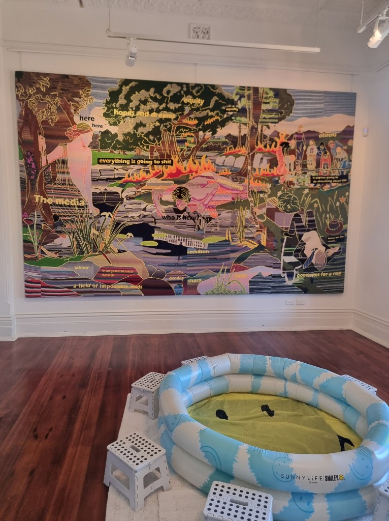
The first room involves Emma Buswell’s and Dhana Merritt’s works, The Pool (2024) and SOAK (2022) respectively. There are some elements that contain a great deal of skill in the former, which is protest art in the form of tapestry. The Pool shows a large, all-encompassing political landscape on fire. The floating phrases in yellow font like “hopes and dreams” and “a field of impossible odds” is loaded with political connotations, as well as being reminiscent to a 2000s MS Word style aesthetic that memes often parody. Certainly, for millennials who grew up during the early 2000s, (including this author) this imagery would be familiar. What makes this imagery particularly relatable is that it is this same generation who witnessed the boom of the world wide web but are now working in the 2020s as burnt out, exhausted adults. We are now completely tied to a post-capitalist/post-covid world with social media and AI, the after-effects of what was once a revolutionary and exciting time. The multi-coloured lines too, almost appear reminiscent to a faulty TV signal: the system in its current form is not working.
While much of the imagery of Emma’s work is reminiscent of the early 2000s aesthetic, there are also some elements from other time periods. Most significantly, the way in which this work has been woven, is from a very traditional technique that was mostly relegated to domestic spaces, rather than viewed as a established art form. The content too, crosses time spans as figures from Ancient Greek mythology, such as Narcissus occupy the same space as a collapsed Barnaby Joyce. Parliament House is reflected in the pond that Narcissus peers into, almost reflecting the self-importance ahead of altruism by those in power. Throughout the landscape, flames threaten to engulf the scene, which brings attention to another issue: climate change. As political tensions rise and workers continue to burn out in a merciless economy that benefits only a few, the earth is still being destroyed. It is a haunting, yet necessary reminder, and on a large scale, this makes the message all the more urgent.
As significant as The Pool is in its meaning, what about those who are not as familiar with conceptual art, or memes? At least two generations will be left out. To add to the confusion, SOAK, an inflatable pool, sits before this enormous tapestry. While both works refer to pools, the messages of these seem to be in stark contrast to one another. Dhana’s work, in contrast to Emma’s, is more conceptual and performative in focus. Audiences are invited during certain times to sit and soak their feet in the pool as a way to relax, which ties in with the general theme of the exhibition. As this work will only be activated by the artist twice, audiences are left with an empty inflatable pool, surrounded by plastic stools. Without the aid of the wall texts, audiences would be at a loss at to what this work is trying to say, since this is just a found object with a purely functional, rather than aesthetic focus. As Dhana’s work encourages audiences to sit together, soak and relax, Emma’s work nearby sharply juxtaposes this purpose, reminding those same audiences that the world is on fire. In having these works placed in the same room together, they contradict, rather than complement each other’s messages. Are audiences supposed to relax, while knowing the world is on fire as our current political and economic climate is doomed?
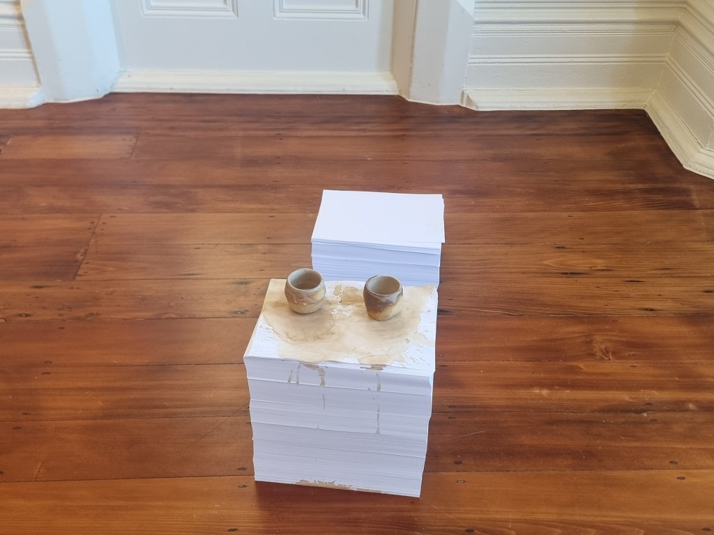
Like Dhana’s SOAK (2022), Jingwei Bu’s Pouring Tea Until It Is All Evaporated (2022) follows a similar approach in that it is performative. Unfortunately, like SOAK, Jingwei’s work is equally confusing without context, as the installation is composed of cups of spilled tea on top of stacks of A4 paper. Yet, I should note that the video in the background does provide some context in that it reveals the performative process of pouring a cup of tea. The video shows the artist, draped entirely in white, performing the gesture of pouring tea, only without the tea present. According to the wall texts, Jingwei’s performance is more linked to Buddhism and the ancient Seven Forms of Offering Tea ritual. The artist’s face is not shown, and the background, like her clothes is white, drawing the viewer’s eye to the action only. When reading the contextual label, there is some connection between the theme and the performance, as the pouring tea ritual is supposed to reflect calmness and mindfulness that comes with Buddhism.
In bringing ancient Buddhist rituals to contemporary audiences, this does provide an alternative to the rat race of a post-capitalist society. Yet, in looking at the installation of the spilled cups of tea on top of the piles of paper, the meaning is not as clear. Why are there two cups of tea on each pile? And why are piles of paper being used as surfaces, rather than chairs and tables? Although there is mention of paper being altered over the course of time from the gesture of tea being poured, this would not be so easily discerned from seeing the installation alone. In being so text-reliant, this confuses the focus of the work, which is to slow down and relax, not try and work out why this is presented the way it is. Unfortunately the layout of this work contradicts the message in which it is trying to put forward. However, I will say that even though Jingwei’s work is highly conceptual in nature, it does pair well with Shannon Lyons’s collection of tea and coffee paintings that were painted during the covid lockdowns. Like Jingwei, Shannon’s work reminds audiences to slow down and focus on the simple things, such as the patterns in the wallpaper. These works are quite detailed and elaborate, although the asymmetrical hanging is a little distracting. However, as a collection, they are strong, and would work even better on a single line hang.
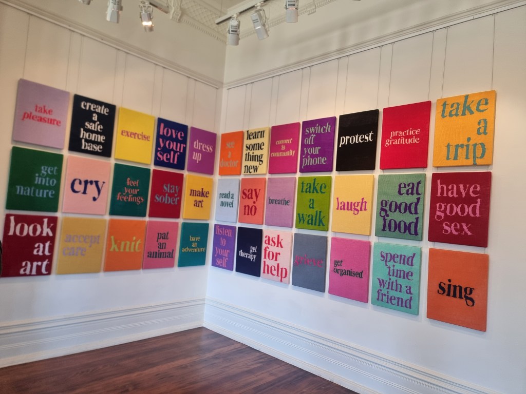
In the same room as Jingwei’s work, Kate Just’s Self Care Action Series (2023), takes on a more explicit message. Rather than subtly reminding audiences to slow down, her knitted signs are bold in both appearance and meaning. 36 signs fill the wall with bright, eye-catching colours of yarn with messages like “practice gratitude” and “switch off your phone”. It is a loud series, which is at odds with the meditative, silent form of Jingwei’s work. For the most part, these messages seem to request the viewer to slow down and relax, which is relevant to the theme of the exhibition. Yet, there are also messages which appear to do the opposite, such as “protest” and “get organised”, actions that probably create more stress than otherwise (and also contradict the other messages). As a collection, and with a three row hang, they all make a strong impact, and perhaps would not have the same effect if presented individually.
One of Kate’s signs do appear on its own, in an entirely different context. Her “rest” sign is hung in a separate room, with bean bags, cushions, a couch and a coffee table. Unlike her other signs, it has a softer tone, the word “rest” knitted in pastel pink against a dark blue background. The muted colours almost seem to whisper the word, rather than shout it, unlike the signs in the other room. On the coffee table, there are various books about meditation and gratitude. This is a space designed to allow audiences to sit and relax, which crosses the line between audience interaction and passive spectatorship (though, one could argue that resting itself could be a passive behaviour, but let’s not debate semantics). This room very much acts as a centrepiece to the exhibition, as a space to unwind, only now it is up to the viewer to do that, rather than to think about it. The “rest” sign becomes a command, rather than an artwork, though for audiences who do not regularly look at conceptual art, it could equally appear as a wall decoration. Participatory art is certainly not new, and has had a long history as far back as the 1950s with Allan Kaprow’s “happenings.” Yet, for audiences who are not as familiar with participatory art, let alone conceptual art, this room would cause confusion as it is not presented as a standard exhibition space. While standing inside it, the room looks and feels more like a living space, which can be quite disorienting for audiences who are used to conventional exhibitions. Would these audiences then know that this is part of the exhibition and not just a random room of things?
While all these works connect to the overall theme of rest, the pairing of some of these works are questionable. In having a work that illustrates the chaos in our post-capitalist society next to an inflatable pool that is designed for relaxing, the message is muddied. There are some skillful and vibrant works which draw our attention, such as the Kate’s knitted signs and Emma’s tapestry. Shannon’s paintings too, are strong works on their own. Yet, the conceptual installations, though valid in their messages, are not so straightforward without depending on wall labels. The combination of conceptual with woven, handmade works, though interesting, is also perplexing. Content-wise, the works individually relate to the theme, yet when presented together, pull the audience in different directions. On the one hand, we are being told to slow down and relax, but at the same time, we have to be aware of a system that burns us out and protest against it. What then, are we supposed to do with these conflicting messages?
It is important to note that all these installations have interactive events connected to them, which is good for community engagement. Yet on the day of my visit, there were no such events, (or performances for that matter) which made the installations all the more alienating and confusing. As mentioned earlier on, these performances are shown on only specific days, rather than throughout the exhibition, making it much harder for audiences to really gauge the messages of the artists involved. This imposes a barrier between the artists and the audiences, causing the meanings, though useful, to be lost. However, this is not necessarily the fault of the artists, but rather, the lack of arts funding to allow artists to activate their works more frequently. As this issue will not be resolved any time soon, it might be worthwhile thinking of a more sustainable way in which to utilise these spaces.
Overall, although this theme is relevant to our time, how does it connect with the history of the homestead? For audiences who would like to visit the homestead in the hopes of seeing traditional art, these conceptual works with contemporary messages would be jarring. Perhaps, more thought needs to be made about the context in which these works are presented in. But I will leave that with you to think about before I delve into this more later on.
Did you see this exhibition and have a different take? Feel free to leave a comment below. Otherwise, stay turned for part 4, for an analysis on Pia de Bruyn’s Female Trouble.

Leave a comment